Friday, March 25, 2011

"Blue Skies & Sunshine" Spring is Officially HERE!


HELLO!

    SPRING is here and can you tell I am super duper excited! Fall is my favorite season for many reasons including fashion and makeup looks, but anyone can get tired of the cold. I know a lot of people in the North and East are experiencing a lot of snow and yucky weather, so let's help them enter spring on a brighter note.


  This look was inspired by my happy mood when finding out it is officially Spring. I got to go to the park with my niece and nephew and feed the ducks the other day and something reminded me it's SPRING.... sudden rain fall haha but it was fun! Grass is growing green again and flowers blooming.
  So enough of my obsession with Spring, let's go on to the look! As you can tell I was inspired with blue skies and sunshine. These colors might be loud but if you apply it correctly, you can really make your eyes pop as well as your mood!


  You don't have to use the exact colors I am, but when using bright colors it is best to use matte. You don't want to draw too much attention to the eyes because the colors already make a statement. More importantly do not use a large section of your eyes for the color. Try to concentrate in one area and then BLEND BLEND BLEND. The more you blend the more "natural" the bright colors can seem. When using a lot of color on your lids try to not line your eyes too dark or wing out the liner. Any dramatic effect can really make the eyes look "clown-like". You want to keep in mind that you want it to be SOFT!

Colors in natural light (more important since it's Spring)

Colors with FLASH and indoors


  Keep the cheeks and lips simple as well. I choose a cool tone pink because I didn't want to keep the focus away from the eyes. Gloss is always a better alternative to lipstick when you're doing a playful look. CHANEL Rouge Allure Extrait de Gloss is really light and natural, yet it lasts forever and non-sticky! Which is a definite plus when you're running around outside.

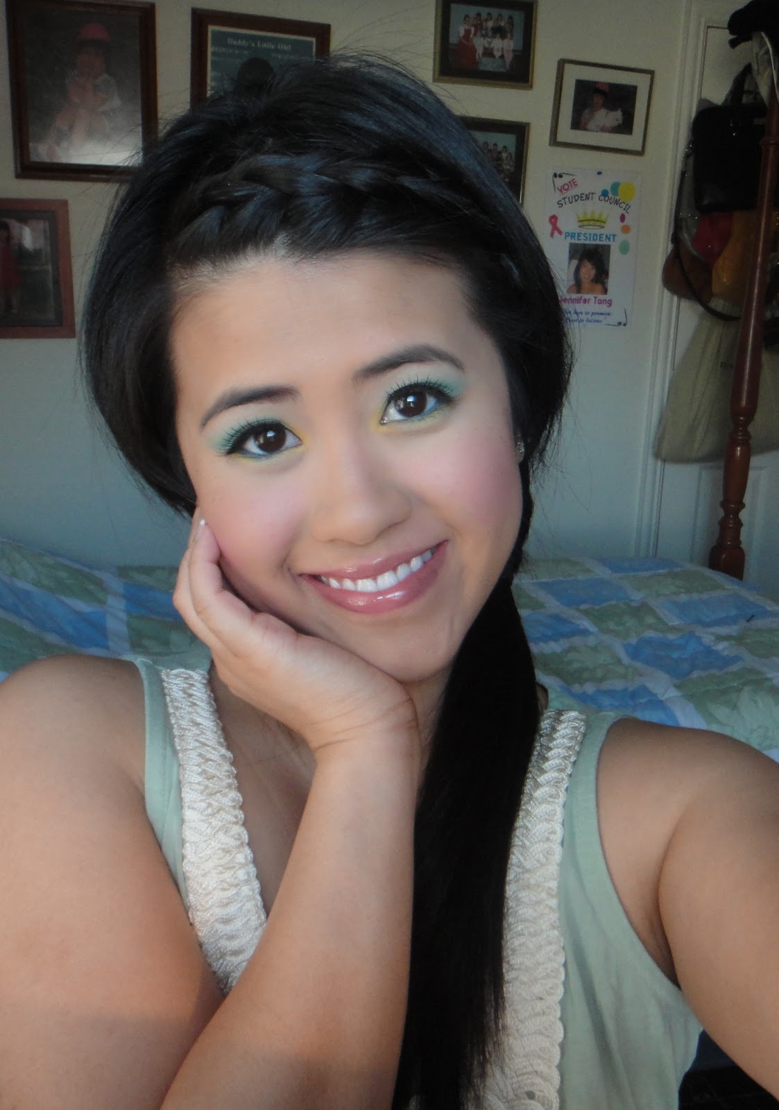

Here are some more close up pictures of my look. Just being silly with the camera. Hope you can see how great these colors compliment the eyes as well as look awesome in pictures! Thanks for reading!!


Couldn't help but laugh at my CAMERA faces. Ew >_<

LOVE & PEACE
Please keep JAPAN in your prayer and thoughts.

Saturday, March 19, 2011

Dance the night away "On the Floor"

Jennifer Lopez


Jennifer Tong


I've been dancing the night away to J. Lo's new song "On the Floor" ft. Pitbull and I LOVE her look in the music video. If you haven't seen it click HERE I absolutely love J. Lo in all of her looks. I've been definitely obsessed over her different looks on American Idol. From the clothes to the hair and makeup, everything is flawless. 

    I used her look when she is wearing the silver jumpsuit in the music video as inspiration. Of course it doesn't look completely like her or her look, but I don't look like her. My eyes are rounder so I had to stop the lower lash liner in the middle instead of further into the corner of the eye. Also bc my eyes are black I didn't want to line my lash line with the brown eyeshadow like she did.  I also changed the main eyeshadow color to a darker blue tone brown due to my dark hair, but that's the art of makeup you have to change things up accordingly to yourself. That's what makes you unique. 


  Let me add that this isn't an imitation, I'm just simply inspired by her beautiful makeup. I hope you guys enjoy it and found something helpful from my video. Try this look out for yourself and remember to tweet it up to yourself and make it your own. Tell me how it goes! 


With flash and more true to colors


Love you all! 

JEN

Monday, March 14, 2011

Ombre Perlees de CHANEL Review

    Hello hello my fellow beauty junkies!


I'm so ready for Spring considering it is Spring Break for me. The trees are blooming flowers, children are playing in the park, and most importantly... pastels, neons, brights OH MY!

  I am a FALL/WINTER kind of gal, but after being in darker tones I am so ready for lighter cutesy colors. Spring fashion with jumpsuits, skirts, and sun dresses are calling my name. Speaking of Spring and the light colorful colors that are associated with it, CHANEL does a different take on Spring with pearl inspired in their new collection. As you've seen everywhere on the net, BLACK PEARL Nail Vernis is the focal point of their Spring Collection. Very odd that darker colors are in the collection, but the iridescent pearl effect just works with spring colors such as corals and pinks.

Palette indoors

  Ombree Perlees de Chanel is an eyeshadow quint that is limited edition. The colors are more of a creamy texture rather than powder. In the pan it looks gorgeous and is similar to different colors of true pearls with many dimension to the color. I must say that CHANEL making it a limited edition is very smart move because there are no DUPES for theses colors anywhere. The quality of specs incorporated into each color is astounding. But does that make the palette a must have???

Palette in Sunlight 


   In my opinion it is could very easily be a pass if you ask me. I know there are so many raves and hypes about this quint just because it is very different from other CHANEL eyeshadows/products but I think the quality pay off on the lids do not live up to everyones expectation. The pigmentation is just too light. Even though, below you will be able to see the swatches, these are actually heavily swatched using the sponge applicator provided by the palette. If you were to use a brush, which I imagine many of us would... the colors do not apply very well. I find it difficult to just use the sponge for most of my applications because it isn't as precise. If you have fair skin I think this would look better on you than it would on anyone with a bit of color. Having a very light canvas and blue or green eyes will work with this palette better. With that said I am saying it would look better in those conditions, but not to the expectations of $65 UD. I wish the colors were similar to the colors in the pain or at least in my swatches but it was just too hard to work with and I do not think it is worth it. 

  I did try to take pictures in the sunlight as well as in different positions for you to see the different shimmers and pearl effect in the shadows. Keep in mind this is heavily swatched with the sponge applicator. This is NOT how it would look if you were to use it with a brush on your lids even with a primer. 

In natural lighting (Direct Sunlight)


Indoors with FLASH

Indoors with Natural Light (No FLASH)

   The last photo, which is indoors without light is almost true to color as it would be on your lids. I tried using multiple primers such as MAC Paint Pot in Soft Ochre, Urban Decay Potion, Lancome Ombre Perfectur, etc. and it just didn't do that much for the shadows. I am disappointed in this item really and decided to go see other reviews... unfortunately everyone else liked it. I have no idea how? Maybe they are like me with some products and are in denial because of the brand status or the packaging perhaps? Or maybe I'm missing something here... Let me know how you like yours or if you've tried it out. 

Thanks for reading and good day! 
Jen


Sunday, March 13, 2011

CONGRATULATIONS WINNERS of OPI Shatter!


Congrats to the winners and its ok if you didn't win. I will have more giveaways so be patient and wait til next time! Thank you for all of your support and love!

Winners I will send you a message via inbox if you are subscriber and via email if you are a follower. Please send me your information as soon as possible.

  I also made a Demo/How to use the OPI SHATTER. Maybe it can help you with applying your OPI Shatter, China Glaze Crackle, or even Barry M Nail Effect. I also mention some ways to help your nail polish from chipping and lasting longer. Hope you watch and let me know if it was helpful.


   Here are some pictures of the new pictures I took with the OPI Shatter in the sun. Teenage Dream is the color underneath, which is also from the Katy Perry Collection. Hope you can see the different colors and sizes of glitter and sparkles under the Shatter. I think this is the best color to go under OPI Shatter, what do you think?


THANKS!
Jen

Friday, March 4, 2011

Britney Spears "Hold it Against Me" Tutorial

BRITNEY

ME

   I got a request from a subscriber/viewer (Michelle Gill) on my facebook for the Britney Spear's look from her "Hold it Against Me" Music Video. The specific scene is the one she is in the white dress. I was so worried I couldn't do it because I didn't have light colored eyes and blonde hair, but I tried my best to break down what makes Britney's HIAM look unique. Trust me, it was hard because there aren't many screen shots on Google that was large enough and I had to continuously press pause and play on her video to see every angle of her eye makeup. Please keep in mind that me and Britney look nothing alike so the look is more like an inspirational look from Britney not how to look like Britney.


   In order to achieve Britney's look I think the most important thing to focus on is the shape of the eyeliner and how intense the color is. The eyeshadow is easy because you only need two colors and could probably just use one. As long as the crease is define at the outer and inner part. I noticed on YouTube people thought that the inner corner of Britney's eyes are "highlighted" with a dark color. I think her crease is larger so it makes it look that way. In order to give depth to your eyes and create a larger crease/lid you need to apply a darker matte brown to the area above the inner corner of your eyes. I mostly used the NAKED Palette from Urban Decay to achieve this look because I think it's one of the palette most people have or at least have the colors in them.

  The most important part is the liner. It is very dramatic and the wing is very long. The tip is thin yet the middle is very thick, therefore the effect is sad droopy eyes. My eyes are round so, I had to draw the liner longer and then fill it in between the top liner and the lower lash liner. You might not have notice but to make the look pop in the lights, Britney's liner has blue specs that make her eyes twinkle. I added a blue liner and blended it out with a gun metal color. To help with the look lashes are also important. Finding the perfect shape and type of lashes can really make a difference to each look. I choose Forever21 lashes for only 2.80 USD. You don't have to get high end lashes as long as you know what shape you're looking for. Britney's HIAM look have unnatural lashes that makes the eyes elongated. I got ones that are full as well as have a flare to the end. Britney's lower lashes are clumped together and are dark, so I bought lashes that are plastic and pointed. 


  In the video I couldn't see Britney's blush very well but I knew she did not have it on her apples but more to the side of her cheeks as contour. I used a rose color with brown undertones because the eyes are the focal point of the look (Bobbi Brown in Tawny #2). For the lips I used a mauve natural pink by MAC in Hug Me (Lustre finish) with a little bit of gloss by Rock and Republic in Hot Sauce, which is a coral with gold shimmers. Even though it looks like Britney is wearing lip liner, I decided to pass because I want the lips to look less played up and let the eyes do the talking. 


   Even though I was afraid to try to mimic Britney's HIAM look, I've learned that it's not that bad once you break things down. I think everyone should experiment with looks that they like on celebrities in movies, magazines, shows, etc. so that you can learn from it. Creativity comes from experimenting. And remember, don't try so hard to copy, but use it as an inspiration. And don't give up. I like using inspiring looks and making it my own with some tweaks. 

Hope you all enjoy this and love ya! 
Jen

Thursday, March 3, 2011

MAC New Launches Overload! Jeanius, Cremeblends, Sheen Supreme OH MY!


   The new MAC Collection Jeanius is launch today at your local MAC stores (pro or counter). I haven't had the time to go check it out, but base on what I have seen online I think it is just "ok". I mean there's not a whole lot to pick from, but they all are limited edition. I do like it when MAC comes up with new colors and make them limited edition rather than just coming up with a fun theme and reintroduce colors that have been in older collections or simply add permanent products or colors. The colors in this collection are jean inspired which is a cool concept but I don't see the theme being incorporated into the packaging at all. Only the eyeshadows have a imprint jeans and a metallic section that mimics a button, which is similar to "To the Beach" collection the metallic layer will wear off after a couple of application. 
If you're interested check out Temptalia's video for review/swatches.

What I like and might get: Just the bright pink blush in Overdyed (Satin finish), but most likely pass just because there isn't anything special about the packaging nor color. There are plenty of dupes. Please, don't take my word for it because I have not seen these in person. I will come back to change my opinions IF they win me over lol. 

Another line is launched today by MAC... Sheen Supreme! ($14.50 each)


       I am extremely excited to see these colors in person after seeing the wonderful swatches from Karla Sugar. I love lipsticks that are almost chapstick or lipbalm texture. I have wrinkly or noticeable creases on my lips, therefore drier formulas are not falttering nor are they something I would want to wear all day. I love Korres Mango Butter lipstick and CHANEL Rouge CoCo Shine formula as well as wear. Love to be able to apply and reapply lipstick without a mirror and without a balm or conditioner first. Seems like a lot of brands are catching the "trend" because Bobbi Brown just came out with new lipsticks that are hydrating and moisturizing too. MAC Sheen Supreme are similar to these formulas, but it seem like the colors are more opaque and SUPREME!! 

What would I get from this collection: Bare Again, Gotta Dash! ( of course because it is a light coral), Ultra Darling, and Full Speed. I will come back to let u know what I think think and what I purchase >_< Hopefully nothing, my wallet is already crying due to the title of this post. 

Another reason today being a MAC Overload... New Cremeblend Blushes ( $19.50)


Even though MAC Cremeblend Blushes are have been introduced once before and all are permanent this Spring 2011 Collection are new colors. There are six new colors if you want to see more description as well as swatches click here.

Which would I get: Probably none because I have about 6 creme blushes from NYX and they are as great for a lesser price of $5- 6 USD. I only use creme blushes during the summer to keep my blush on all day and setting it with a powder blush.  I wouldn't wear it by itself because the tacky and sticky texture might attract dust, hair, etc. 

OK! Whew that was a long and overloaded post. I hope I did a good job overviewing the three new collections from MAC that is launch today. Check it out and let me know what you think! 

Have a great day and don't be too overwhelmed!
JEN :) 

Tuesday, March 1, 2011

Wild for Wet N' Wild New Eyeshadow Palette


   I have been in love with this palette from Wet N' Wild and just had to share it with you all. I got it Super Bowl day when I needed a little bit of a pick me up after running errands and didn't have anything special on my face but powder. I got it at CVS and simply applied the definer color on the right and a little bit of highlighter for the evening. It's great when you least expect to like something... you fall in love.

 This is with direct sunlight to see texture and shimmers
(Scroll down to the end to see close up of these colors)
This is the taken in shade which shows how the colors are indoors.

   The quality of the palette is actually very impressing because for only 4.99 USD for 8 shadows I was expecting BLEH. It's so pigmented and great to use with use a sponge tip applicator or your fingers. I do experience an amount of fall out, but we cannot expect high end material. For what it is and the price I think it is an excellent product. Love every single color and they are very complimentary to each other. I do not use the colors as it is directed, but I do notice that if you do not know how to pair colors you cannot go wrong with any combination from this palette. 

   Here are some pictures taken indoors in different angles so that you can see the many dimensions these colors have. I personally love the last color on the lowest right hand corner. It is similar to Lawsuit by Rock and Republic. In some angles it is a lighter brown and in some you can see the green in it. I use this often by itself all over my lids and it looks like I put a lot of effort into it. 

 Notice the "Definer" color on the right is different in both pictures. 

Close up of the color I'm obsessed with.


 I think this color is worth the 4.99 USD by itself. I will post and update on some looks using this palette to give you some ideas soon. I hope you like it and hopefully you will be able to find it at your near by drugstore that carries Wet N' Wild. There are also similar palette like this one from the collection such as blues, purples, and greens. But of course, I stuck with the neutrals. 

Here's a closer look at the colors swatched

 As you can see all of these colors are NOT MATTE and are very shimmer. If that's what you like then great! I think a little shimmer makes your eyes brighter and twinkles. These are shimmer not frosty or glittery. I think the pigments are great and the lasting power is super!


:)
Jen